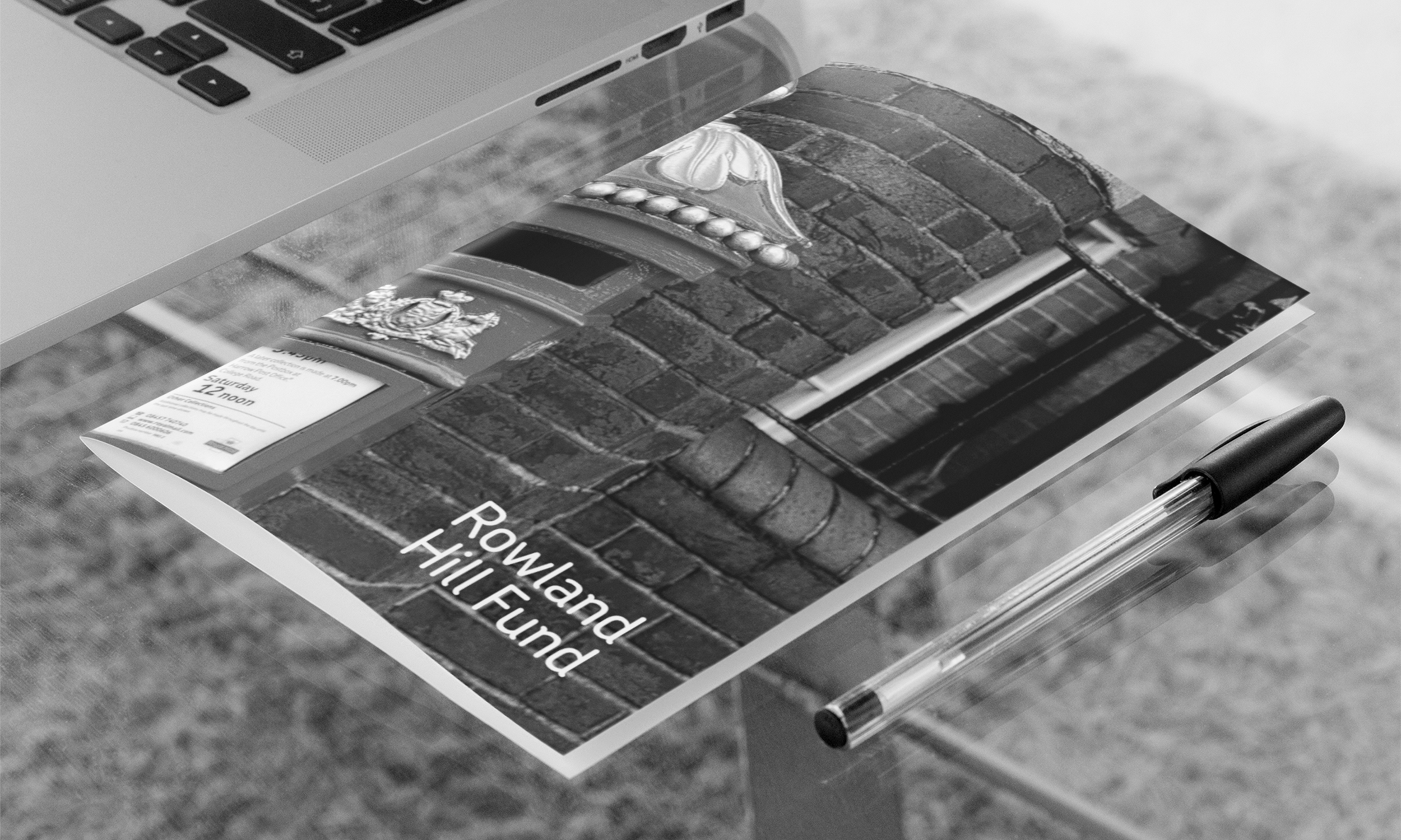
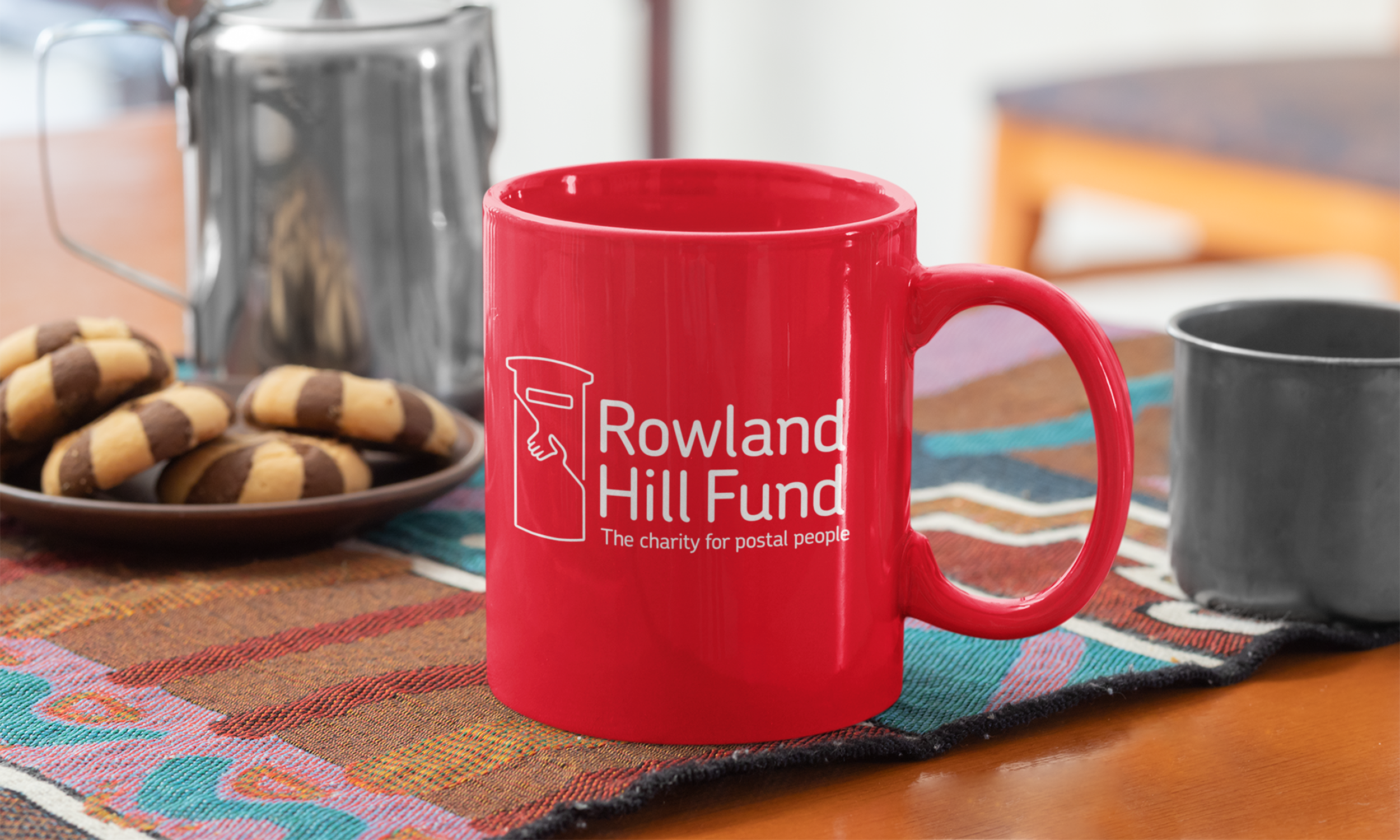
Rebrand for Royal Mail’s Charity
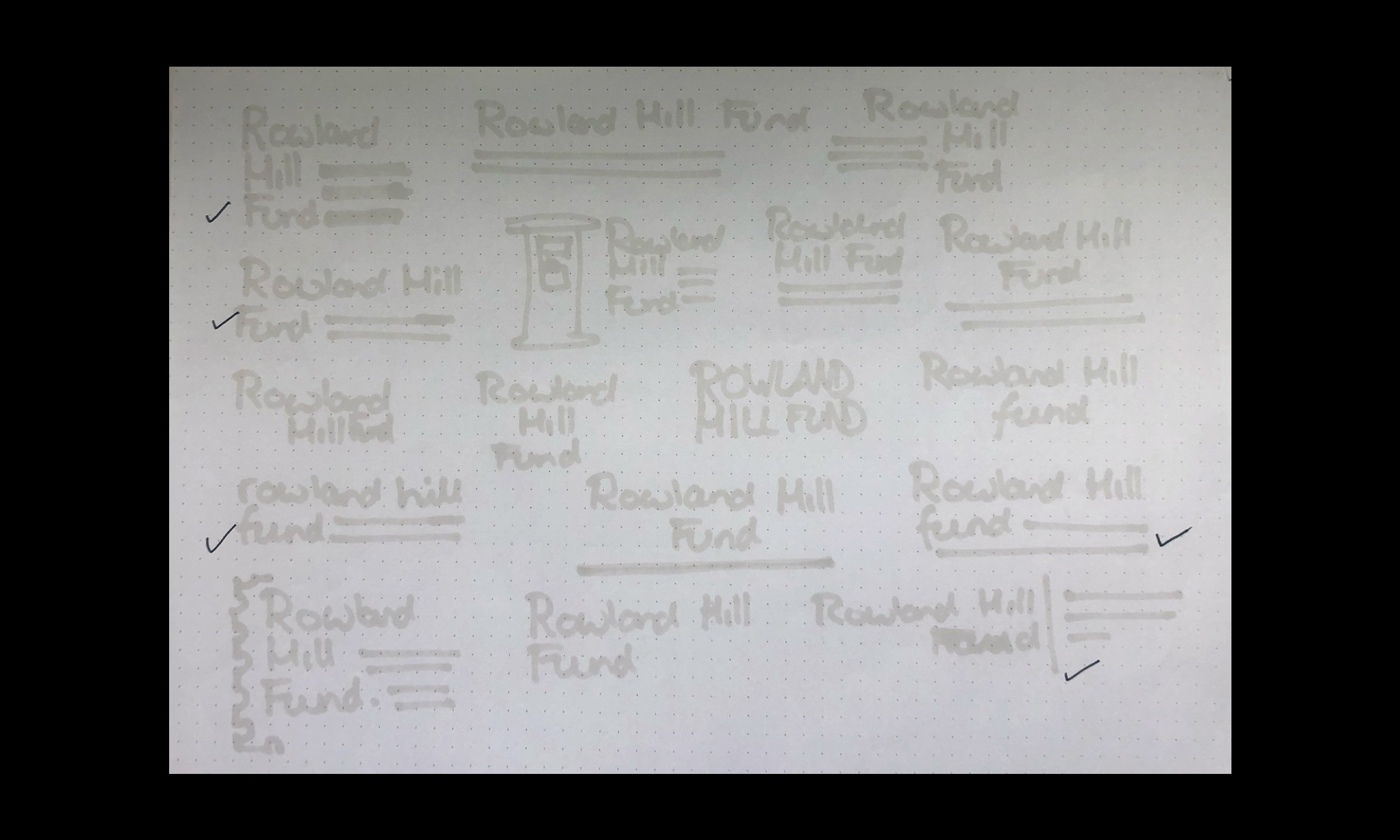
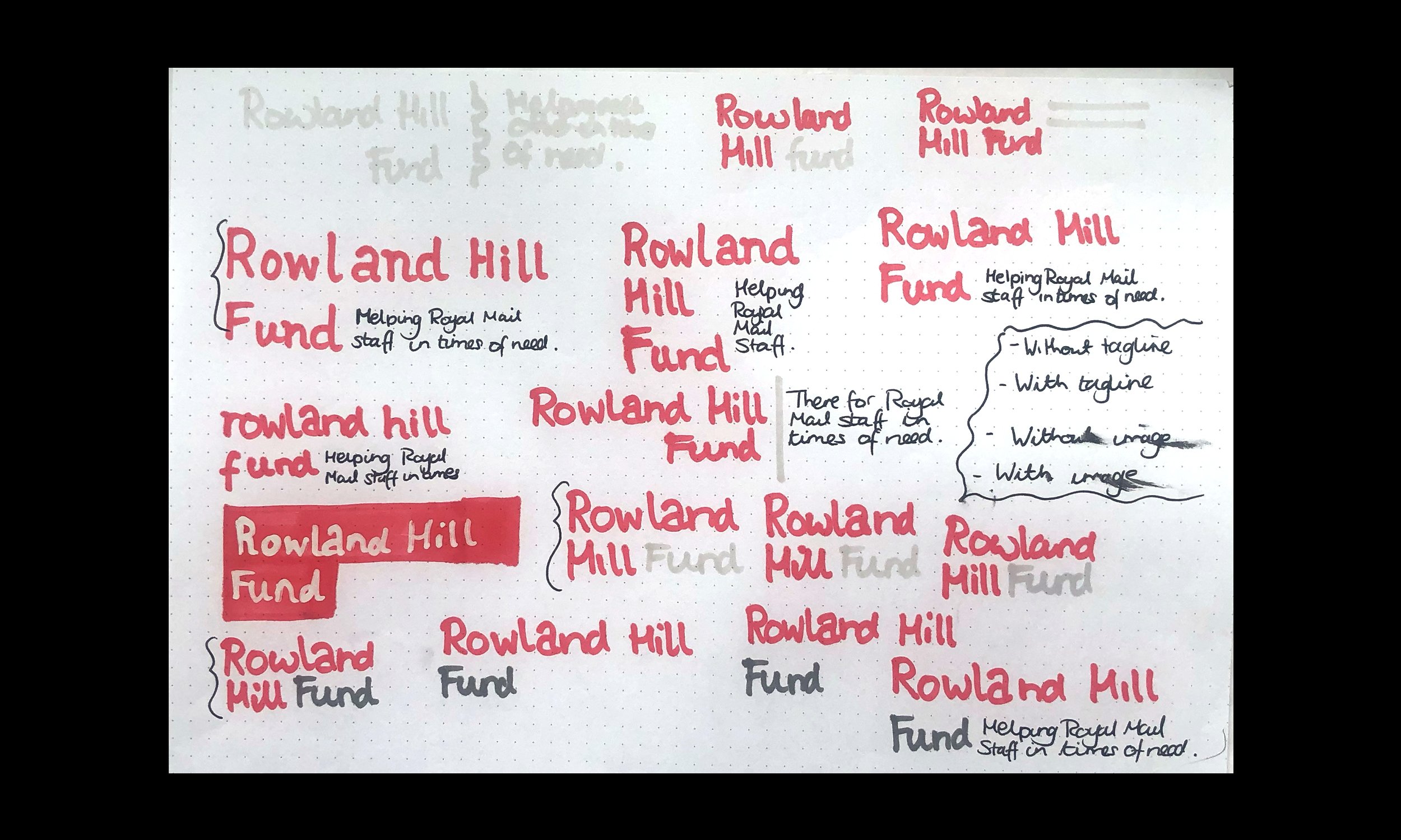
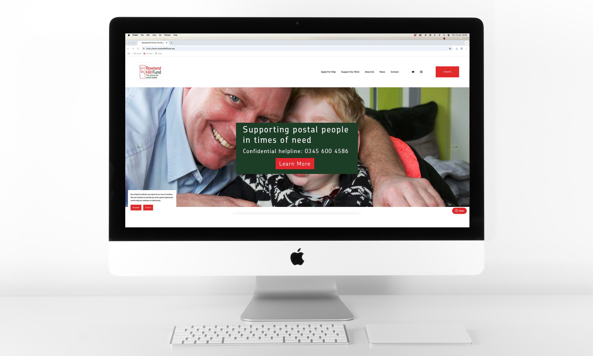
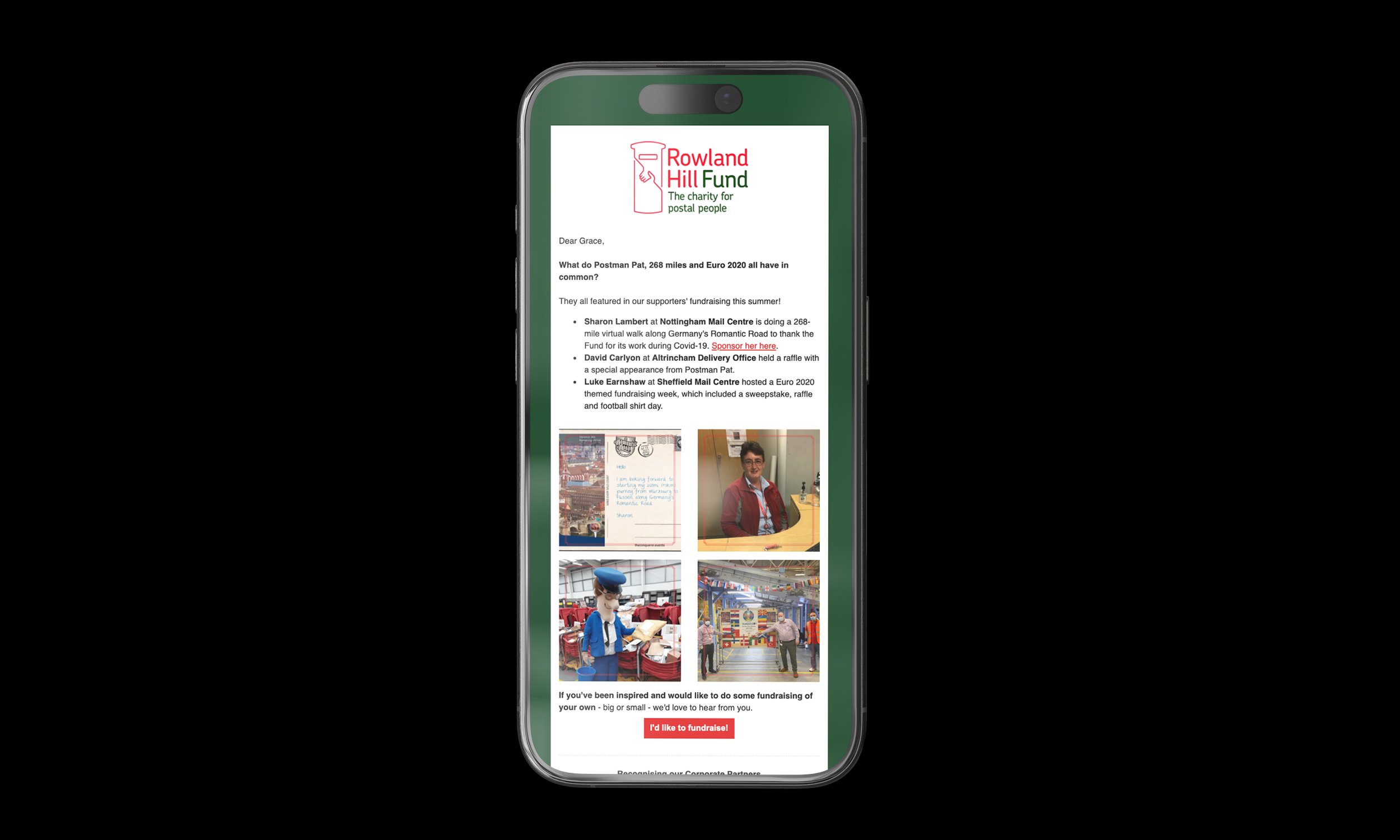
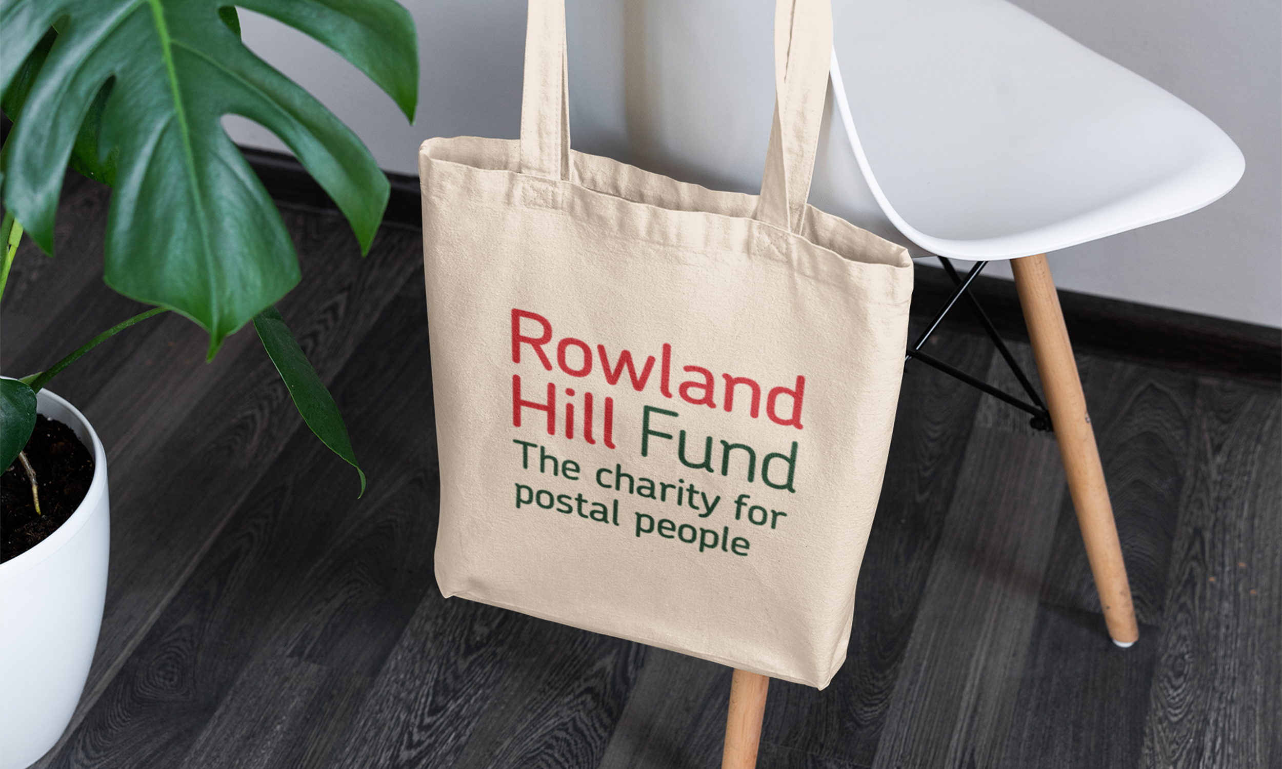
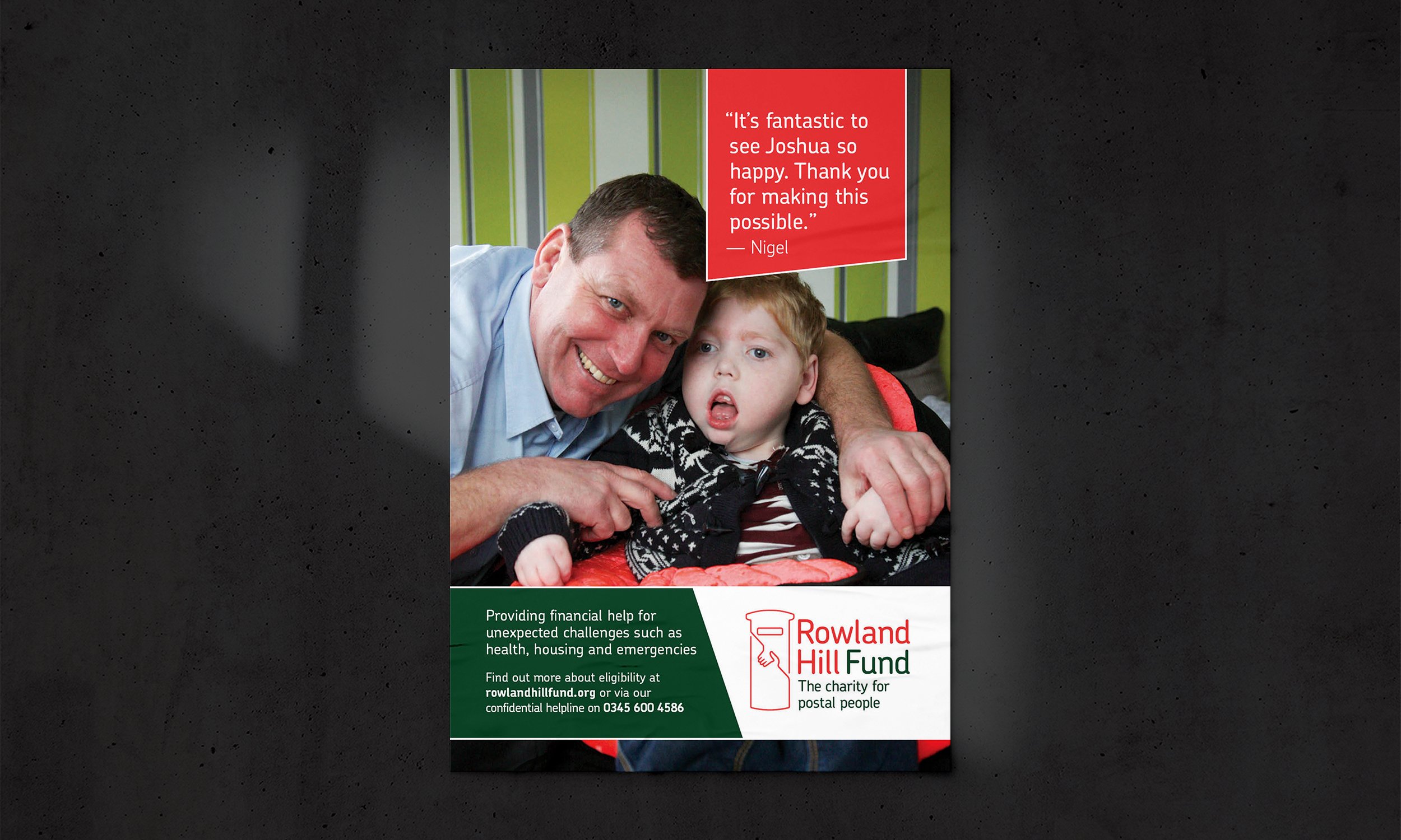
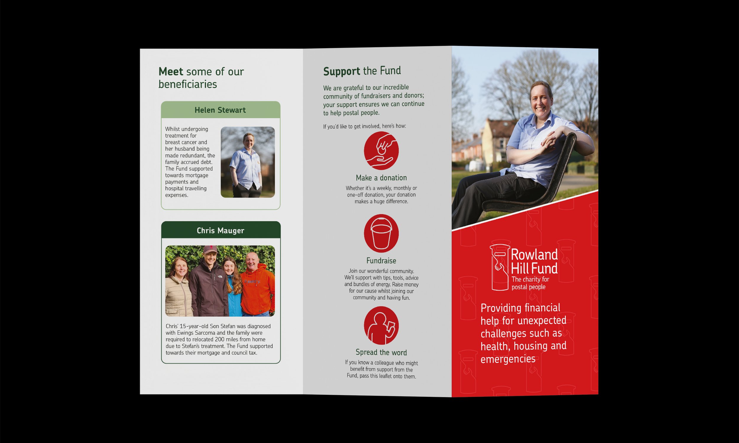
Established in 1882, Rowland Hill Fund is Royal Mail's benevolent charity. Grace was briefed to increase brand awareness. To achieve this, a rebrand was required.
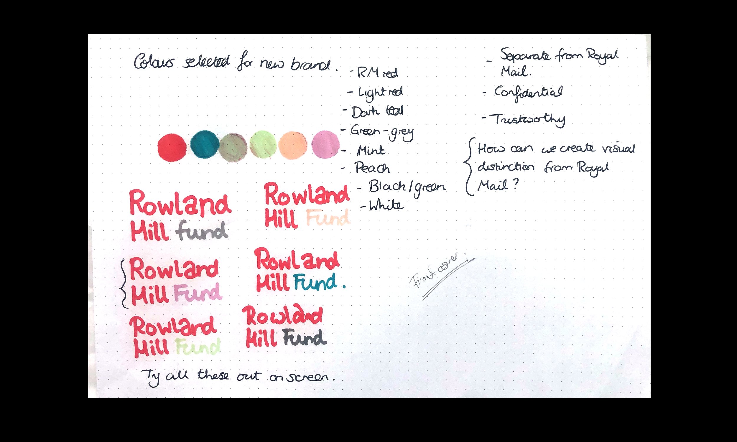
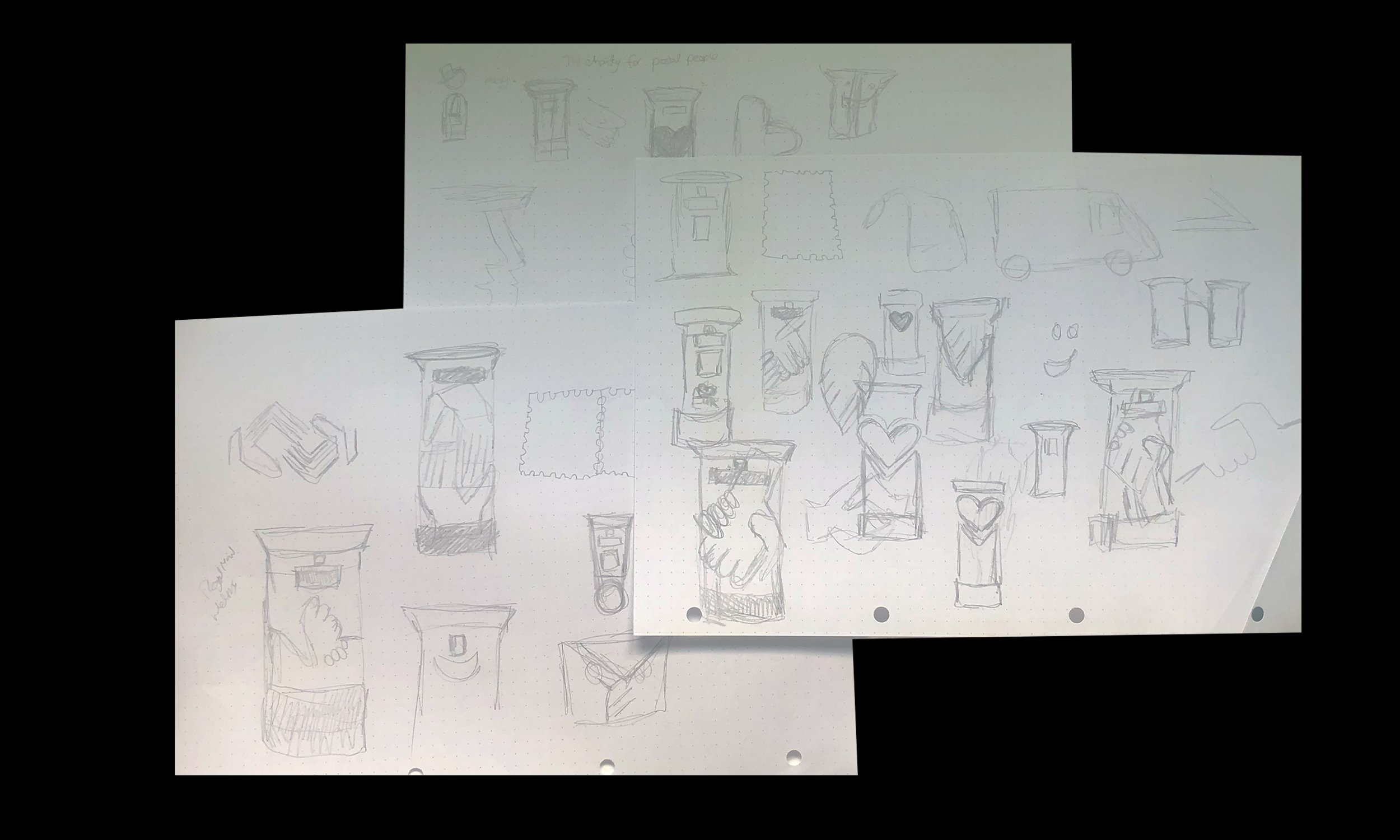
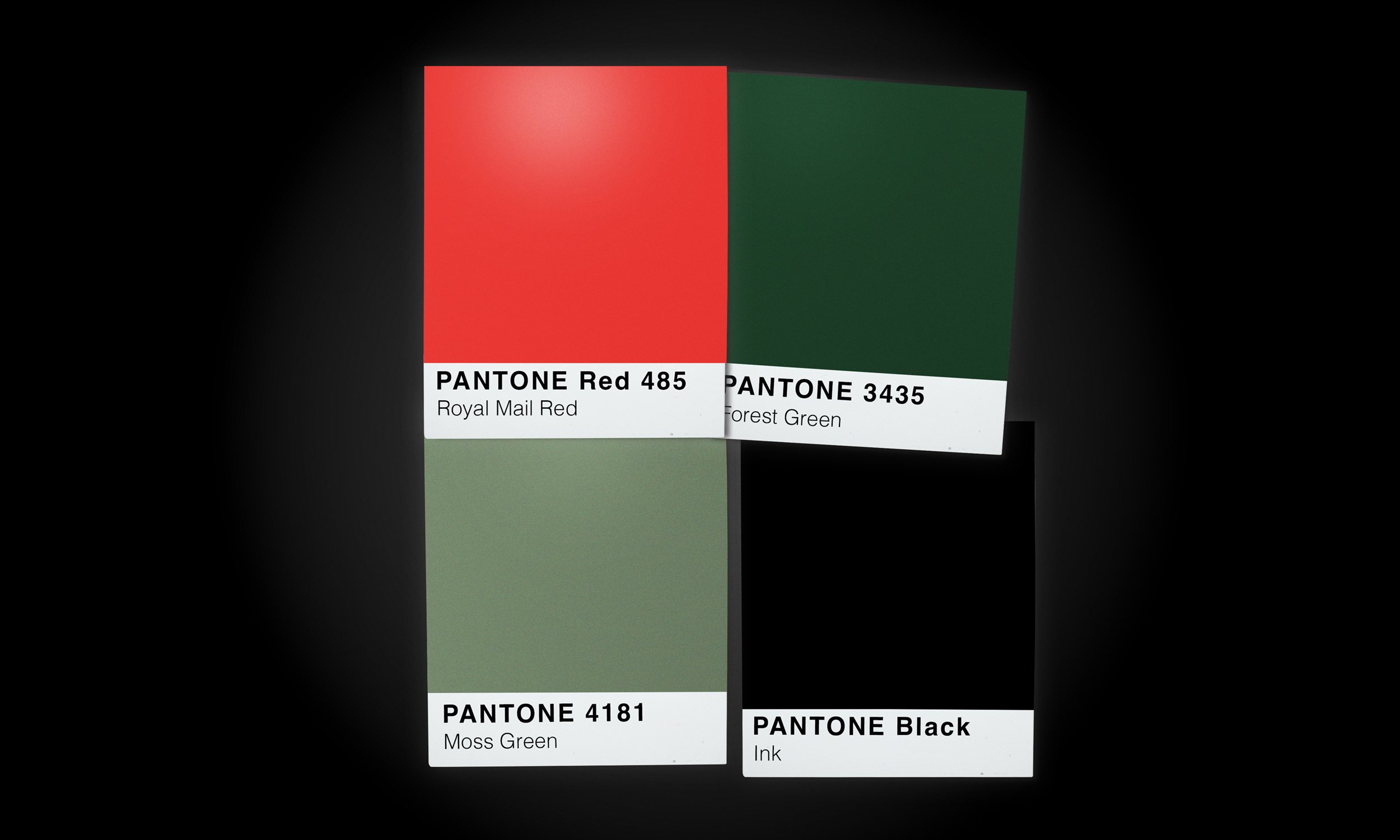
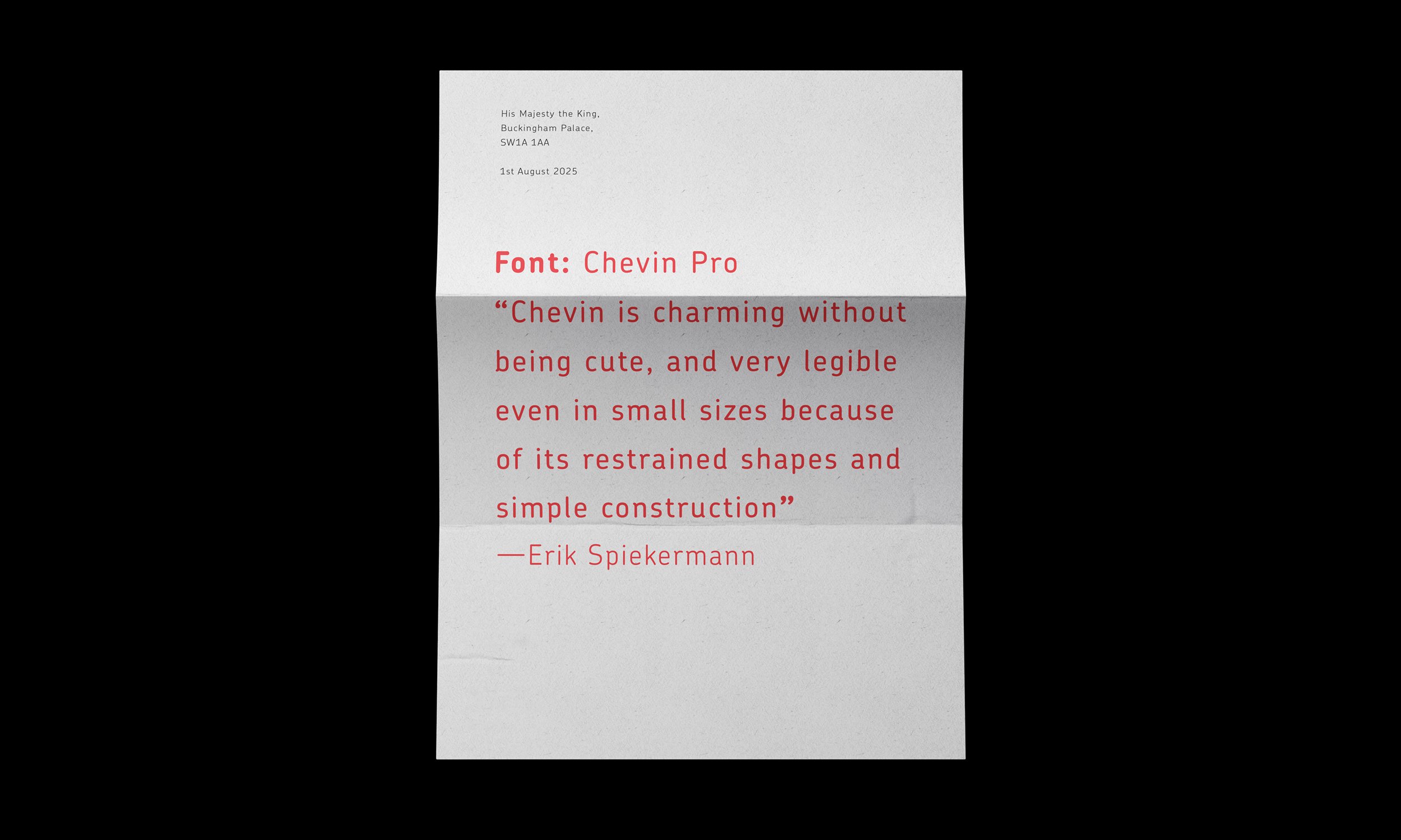
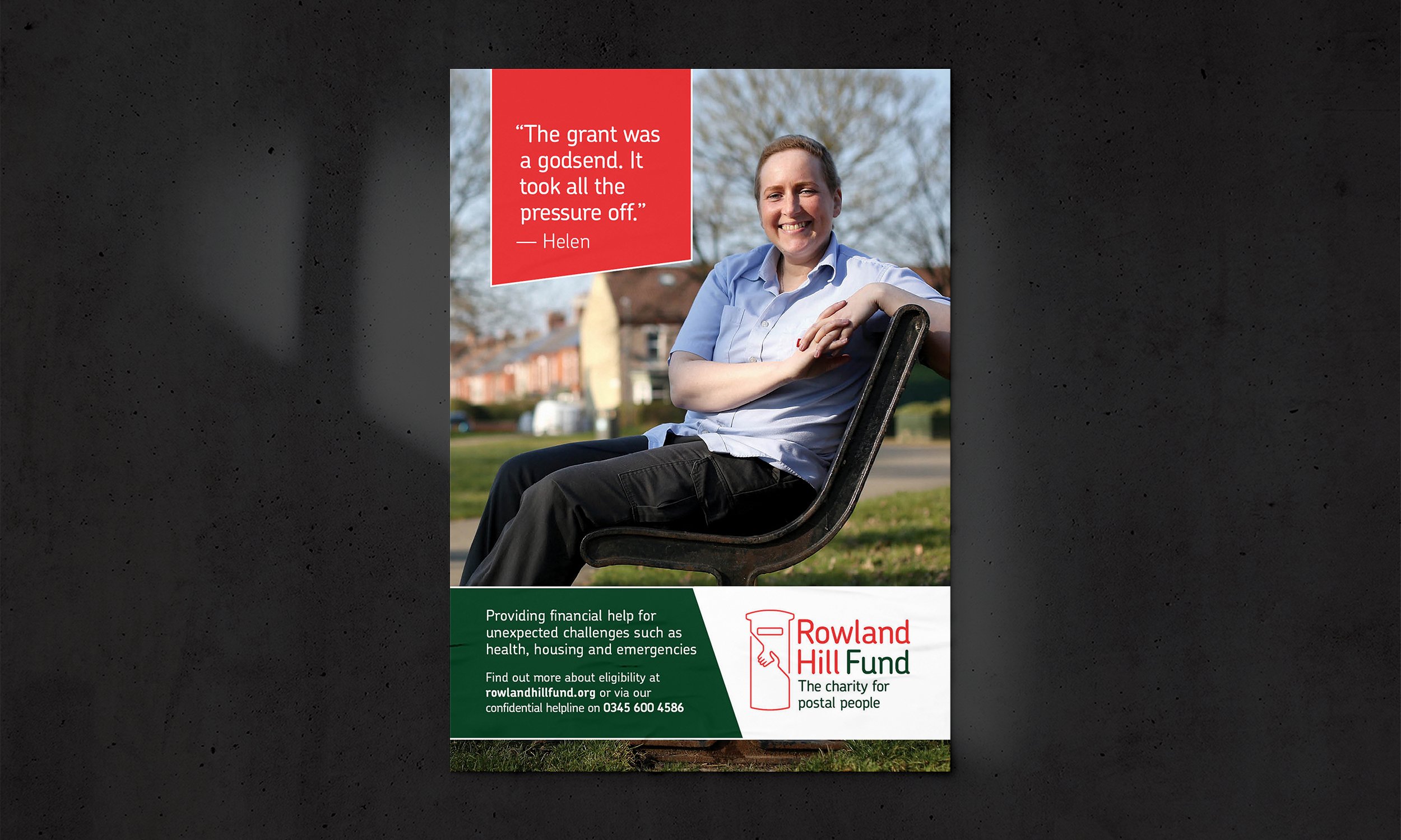
Royal Mail's font Chevin was paired with a new colour palette, including the iconic Royal Mail red. Finally, the introduction of icon logo signified the charity's function.
A metric of the project’s success is engagement with the charity increased by 98% within the first year. More people were helped, and greater numbers knew where they could turn in a crisis.
"We commissioned Grace to refresh our brand. She listened to our needs and concerns with the uttermost care, and was highly responsive to our input. The finished work was creative, intelligent and beautiful. Grace made the process easy and pain-free. We would highly recommend Grace, and look forward to working together in the future."
Grace Owen, Executive Head, Rowland Hill Fund